
Thank you! Your submission has been received!
Oops! Something went wrong while submitting the form.
Client
Archer & Olive
Services
Conversion Rate Optimization
Design
Shopify Development
Time together
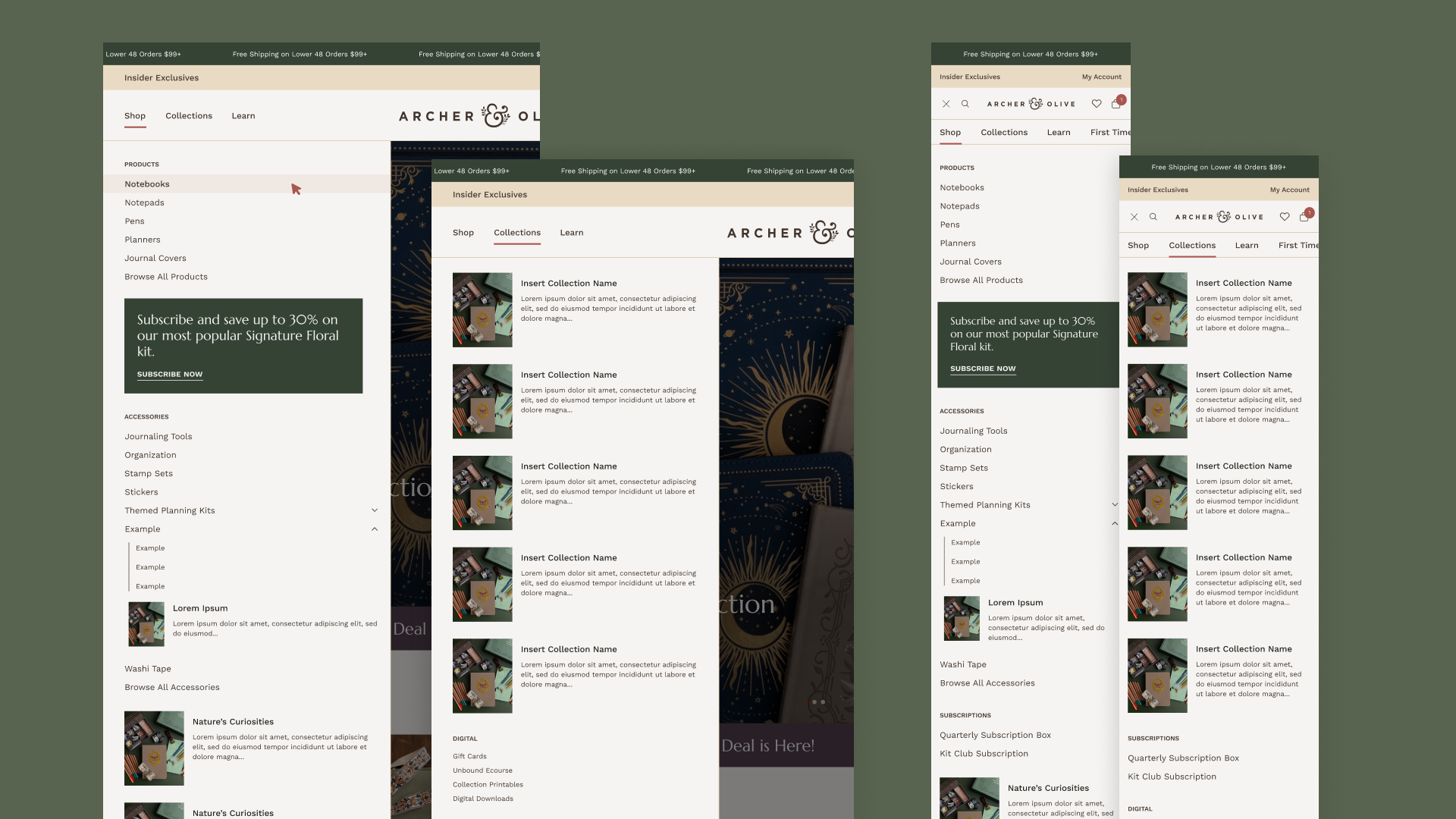
Archer & Olive is a premium stationery brand known for thoughtfully designed notebooks, planning tools, and creative supplies.
+22%
Completed Checkout

+36%
Add to Cart
+25%
Sessions

Archer & Olive is a premium stationery brand known for thoughtfully designed notebooks, planning tools, and creative supplies. Their products emphasize craftsmanship, creativity, and mental wellness, and their audience is deeply loyal and design-savvy.
While the brand and products were already strong, the website and broader visual system did not reflect the maturity or quality of the brand. This project was not just a redesign, but a strategic evolution of Archer & Olive’s brand expression and digital experience.
Prismfly partnered with Archer & Olive to refine their visual system, modernize the site experience, and build a scalable foundation for product launches and long-term growth.
.jpg)
Archer & Olive needed a site that would:
Their previous site struggled with cohesion. Products felt disconnected, the experience felt busy, and merchandising for repeat customers, who make up the majority of their audience, was harder than it needed to be. The site also had accessibility limitations that made navigating and shopping more difficult for some users.
With the logo remaining unchanged to preserve brand recognition, Prismfly focused on refining how the brand shows up everywhere else. This included:
A key goal was ensuring the visual system felt consistent but flexible, able to evolve with seasons and drops without feeling disjointed.
Design decisions were meticulously validated not just in website mocks, but across graphics, thumbnails, and potential future brand applications, ensuring the evolution could extend beyond the site itself.
We built the site using an modular framework to strike a balance between:
This framework allowed design and development to collaborate earlier and more fluidly.
This reduced friction, improved alignment, and let both teams focus on experience and functionality, not recreating fundamentals.
.png)
.png)
These elements don’t exist to “boost conversion” directly, but they build trust, delight, and emotional connection with the brand.
This project is a clear example of how Prismfly approaches redesigns:
From small details like viewport-specific button visibility to larger systems like color schemes and reusable presets, the goal was simple: remove future roadblocks before they exist.
.jpg)
With a refined brand expression and a flexible Horizon foundation in place, Archer & Olive now has a site built to evolve. It supports new collections, campaigns, and creative ideas without constant rework.
This project was an investment in the brand’s next chapter.