Thank you! Your submission has been received!
Oops! Something went wrong while submitting the form.

October 27, 2025
|
5
min read
Designers often aim for perfection: a perfectly balanced layout, an ideal hierarchy, carefully spaced typography.
Testing disrupts that. The minute a headline is longer in Variant B, spacing breaks. The moment an image block is swapped for a carousel, the grid alignment feels off.
Testing introduces “design entropy” where multiple variants can collide with the intended visual system.
If this tension is not managed, teams end up with brittle designs.
Developers scramble to patch edge cases, and experiments get delayed or abandoned. Worse, the brand experience begins to feel inconsistent to users.
The most important foundation is modularity.
Interfaces should be built from reusable components, not fragile page-level templates. A product card, for example, should work with two lines of copy or six. A hero section should function with one button or three.
By designing modularly, you give experimentation room to breathe. Each component is flexible enough to adapt to variant changes without breaking the overall grid.
This approach also makes implementation faster since swapping variants does not require rethinking the structure each time.
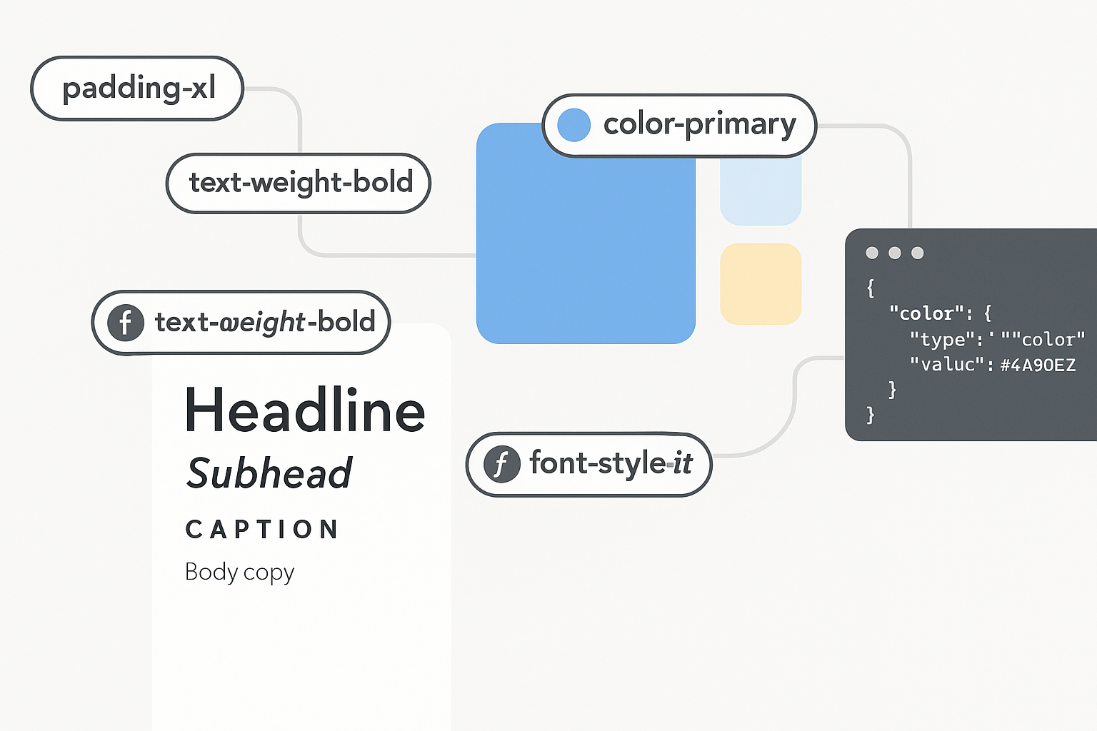
Design tokens, such as values for spacing, typography, colors, and other properties create consistency. Without tokens, experimentation can quickly introduce visual chaos. Imagine Variant A has a button with 12px padding, while Variant B has 14px.
The inconsistency may look small in isolation but becomes magnified across the site.
When decisions are tokenized, variants can change without introducing new one-off values.
That keeps the design language intact and prevents experiments from diluting brand identity.
Every experiment creates potential edge cases.
A longer form field label, a multi-line button, or a stacked product badge might never appear in the original design but can surface during testing.
Instead of waiting for problems to emerge, designers should intentionally stress-test components.
For example:
By exploring these scenarios in advance, you design not just for the ideal case but for the messy reality of testing.
A/B testing is not only about micro-optimizations.
At times it shifts the hierarchy of the page itself, and designers should account for this.
If a layout depends entirely on a single visual hierarchy, it will collapse once hierarchy changes.
Take the checkout page as an example.
One variant may prioritize payment security messaging while another emphasizes express checkout.
The design must allow either element to rise in prominence without breaking flow. In practice, this means building layouts that can gracefully reorder elements while still feeling intentional.
Not every test runs as planned. Sometimes traffic is too low, or a variant has to be paused.
If a design lacks defined fallback states, interruptions create broken or confusing experiences. Designers should always plan for defaults.
A recommendation block should not leave a blank hole if product data is missing. A headline test should fall back to a clean baseline.
This principle prevents experiments from leaving scars on the interface.
Some designers fear that experimentation cheapens brand identity, reducing design to whatever converts best.
The opposite can be true. A well-designed testing system strengthens the brand by ensuring all variants still reflect its core principles.
For instance, a luxury brand may test different hero images but will always enforce strict rules on typography and spacing. A playful brand might experiment with copy tone but will always maintain consistent use of its accent colors.
In this way, testing becomes an extension of the brand, not a dilution of it.
Designing for experimentation requires collaboration.
Designers should understand how testing tools work, while experimenters should respect the integrity of design systems. Practical collaboration might include:
When these practices are in place, experimentation stops being disruptive. It becomes a natural extension of the design process.
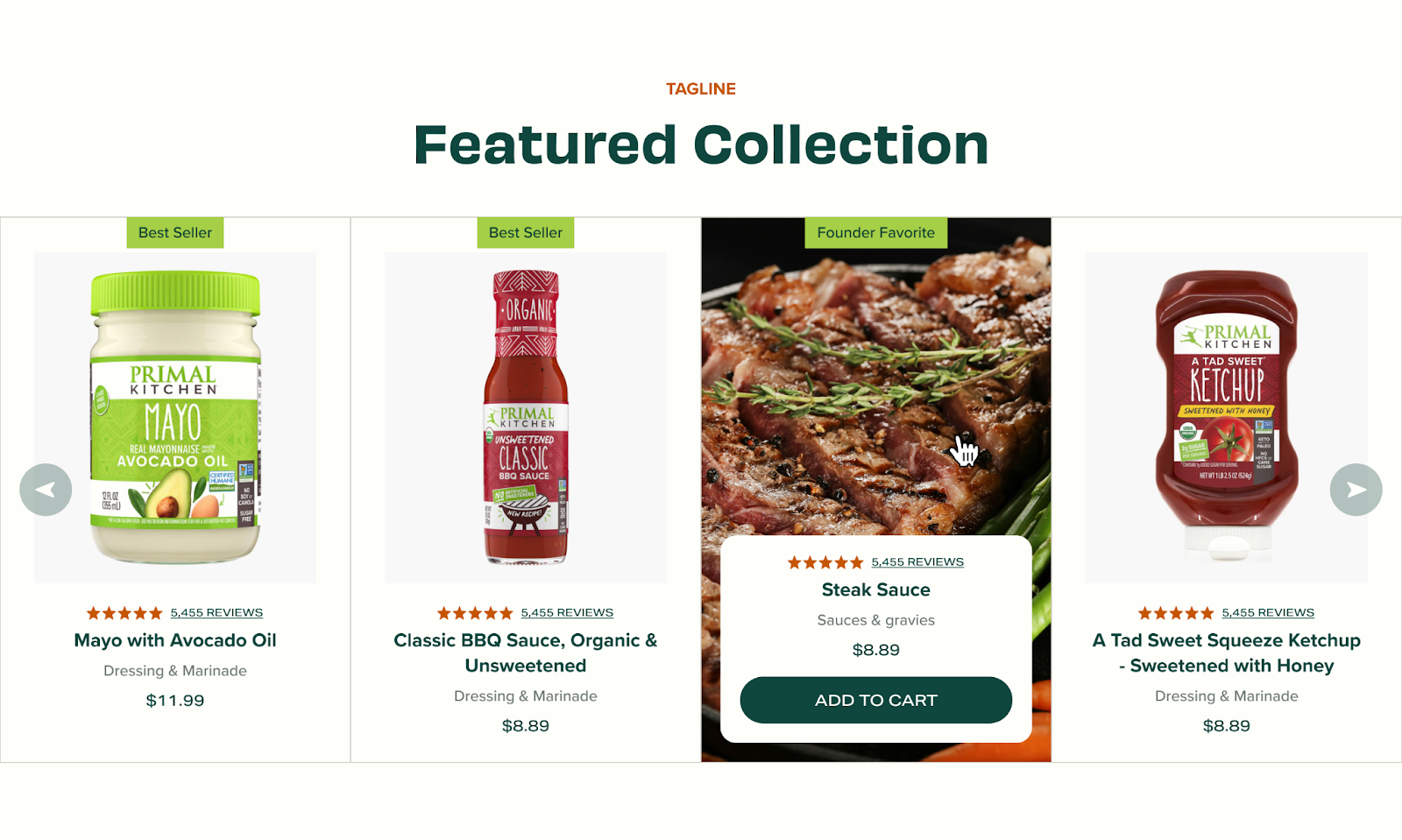
Consider a product recommendation block on a product detail page.
Without foresight, a test swapping in different recommendation algorithms can break the design. Product cards overflow, spacing collapses, and the block no longer feels cohesive.
If the block is designed modularly, tokenized, and stress-tested, the experiment is seamless. Variants may change the algorithm or arrangement, but the design holds. The brand remains intact, and the test generates insights without creating noise.
Designing for experimentation is about more than aesthetics.
It is about creating systems that are resilient, flexible, and prepared for change. Testing will always introduce unpredictability.
The question is whether design anticipates it or crumbles under it.
By focusing on modular components, tokenized decisions, edge cases, flexible hierarchies, and fallback states, designers build interfaces that can handle experimentation at scale.
The result is a brand experience that feels consistent to users while still enabling rapid optimization.
When design and testing work together, experimentation does not break the interface. It strengthens it.
Junior UI/UX Designer
Ani is a UI/UX designer specializing in web design and branding at Prismfly, blending data analysis and AI expertise for compelling digital experiences.