Thank you! Your submission has been received!
Oops! Something went wrong while submitting the form.
October 30, 2025
|
3.5
min read
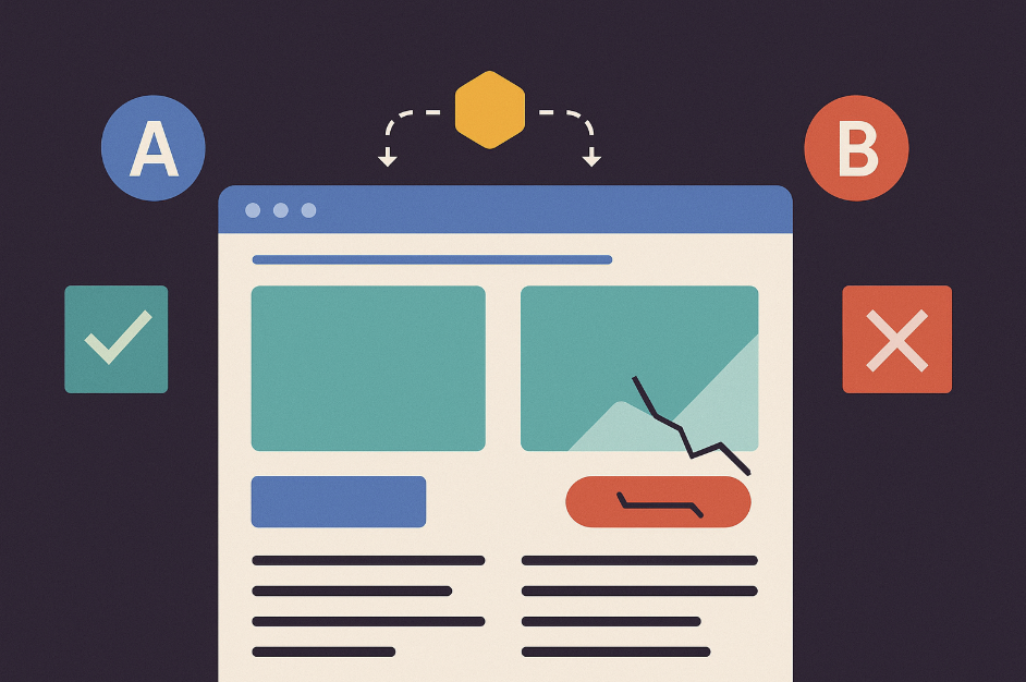
A collection page is often where browsing begins.
It shows customers a wide selection of products, but without structure it can quickly feel overwhelming.
Hierarchy ensures order by creating a predictable path for the eye.
Visual suggestion #1: Side-by-side example of two collection pages: one cluttered, with products crammed together, and one clean, with filters at the top and a consistent grid.
Hierarchy on collection pages is about flow: headline → filters → product grid. This simple structure helps customers scan efficiently and stay engaged.
The product detail page (PDP) is where interest becomes intent. A strong hierarchy here reduces hesitation and builds trust.

Visual suggestion #2: Annotated PDP mockup with arrows showing the intended path: Image → Title & Price → Add to Cart → Supporting details.
Hierarchy on PDPs ensures that the shopper quickly understands what the product is, how much it costs, and how to buy it. Everything else supports these essentials.
The checkout page is the most critical stage.
Poor hierarchy here leads directly to cart abandonment.
Strong hierarchy, on the other hand, eliminates friction and gives users confidence.
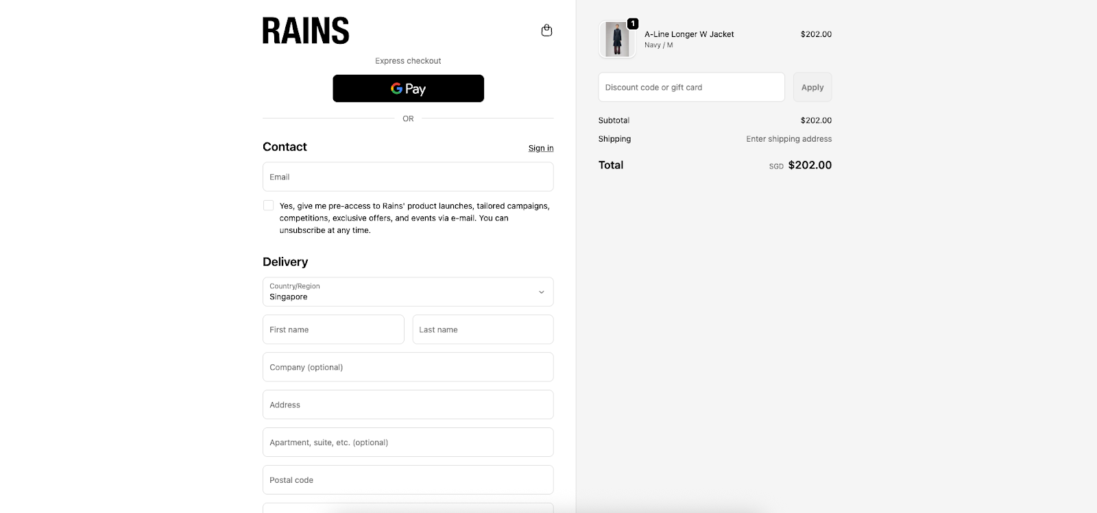
Visual suggestion #3: Wireframe of a clean checkout page: progress bar on top, tidy form fields in the center, and a bold action button at the bottom.
Hierarchy here is not about aesthetics alone. It is about reassurance.
By making the process predictable and clear, customers complete purchases without unnecessary hesitation.
Across these three touchpoints, the same principle repeats: hierarchy reduces cognitive effort. It allows users to understand what matters most at every stage.
When hierarchy is weak, users feel lost and distracted.
When it is strong, the design fades into the background, letting the products and brand take center stage.
The power of visual hierarchy in design lies in its ability to make complex experiences feel simple. It shapes attention, reduces uncertainty, and creates trust.
In ecommerce, this directly influences engagement and conversions.
The best experiences do not overwhelm the user. They create flow, where every element feels intentional and every next step feels obvious. That flow is the result of thoughtful hierarchy.
By focusing on hierarchy across collection pages, product detail pages, and checkout, brands can transform the customer journey into something seamless and satisfying, turning casual visitors into loyal customers.
UX/UI Designer
Faizal is a designer at Prismfly who loves bringing ideas to life through UI/UX design and video animation. He’s all about creating visuals that not only look good but tell a story and perform well.