Thank you! Your submission has been received!
Oops! Something went wrong while submitting the form.

March 7, 2023
|
11.5
min read
When you’re in your flow, the last thing you want is to be interrupted — and your site’s users feel the same way.
User flow refers to how your website’s visitors complete different actions and in what order. These flow actions could include making a purchase or just simply reading your about us page. You can diagram users’ common series of actions with a user flow diagram. A user flow diagram charts the steps users may take as they navigate your website.
User flow differs from site flow because you’re considering your site’s organization from the user’s perspective. Site flow is relevant to the mechanical layout, whereas user flow is more open-ended and task-oriented.
There’s more than one way to arrive at a product’s “add to cart” button, but there is only one “add to cart” button per product. Some customers might hit that button after viewing three pages, while others might browse for hours before completing the same task.
So, how can UX optimization improve user flow? That’s the question of the day. User experience (UX) plays a significant role in user flow. A smooth user flow (or lack thereof) can determine whether a customer completes a purchase or abandons their cart.
So, let’s explore what UX is and how it affects the user flow on your eCommerce site.


The goal of UX design is to make the online shopping experience as seamless and enjoyable as possible for any and all potential customers. A positive user experience can increase conversion rates, higher user retention, and ultimately more revenue for your eCommerce business.
Below, discover some aspects of UX in eCommerce.
The first thing potential customers notice when they visit your eCommerce website is its overall design and layout.
Most customers judge the reputability and quality of your site in the first fraction of a second before the page has even finished loading. It's essential to make a good first impression to keep customers engaged and interested in your products.
Modern web design trends prioritize clean and minimalist designs, using bold colors and high-quality product images to make an impact. Social media interactivity and customer reviews can also be integrated into the design. This not only adds credibility to your site but also encourages potential customers to share their experiences on social media platforms.
The design of your site is only one aspect of UX design. The functionality and usability of your site are also crucial. An intuitive and easy-to-use site can make all the difference when it comes to the purchase process.
For example, an efficient checkout process can reduce bounce rates and increase conversion rates. Your site should be designed with the customer journey in mind, meaning every step of the purchase process should be as straightforward as possible. This includes easy access to the shopping cart and a clear call to action (CTA) on every page.
When considering your site’s usability, this is also a great time to consider users of different technical abilities. Consider people with disabilities who are using adaptive technology, like screenreaders, to access your site. Consider the elderly, who may not be as tech-savvy as the young folks.
Remember, your site doesn’t come with a user manual, so it’s up to you to make the functionality as intuitive as possible for all kinds of people.
User experience (UX) design and user interface (UI) design are often used interchangeably, but they are not the same. UX design is the overall experience a user has when interacting with your site, while user interface design focuses specifically on the visual design of your site.
UI refers to the digital elements the user may interact with on the screen, like buttons, icons, toggles, and all other visual elements. UI design also includes elements such as the color scheme, typography, and layout of your site. It’s everything that the user will interface with, but it does not include the user themselves.
It's important to note that while UI design is a critical aspect of UX design, it's not the only factor. UX refers to the entire interaction a user has with the site, including how they feel about the experience: the whole of the user’s experience, as the name might suggest.
UI impacts UX, but the two are distinct. Consider having a separate designer for each. Both UX and UI design should work together seamlessly to create a positive user experience.

Some pages will simply get more traffic than others, and that’s okay! When optimizing your site’s UX, it’s best to prioritize the pages before beginning the process — even if they could all use a little revamping. Here’s a suggested order in which to prioritize your optimization efforts.
Your homepage is typically the first point of contact for potential customers. This is the quintessential first impression page, so make it count.
To make a good first impression, the design should be clean, modern, and easy to navigate. Try to limit animations and pop-ups, as these may overwhelm and deter visitors. The eye is naturally drawn to bright colors and movement, so use those elements sparingly and intentionally to draw attention to only the most significant areas.
The homepage should feature high-quality product images, clear calls to action, and links to your most popular products or product categories. It's also smart to include customer reviews or social proof to increase credibility and encourage potential customers to explore your site further.
However, these can be lower on the page since they don’t present an immediate call to action. A low bounce rate starts with an inviting homepage.
Your products are the pride and joy of your business, and they’re the main reason your visitor is on your site in the first place. These pages deserve the best polish you can give them.
As the name suggests, product pages are where potential customers learn more about your products and hopefully add them to their shopping carts. Therefore, it's essential to ensure they are designed with the user in mind.
The product name and product details should be prominently displayed, and high-quality product images and videos should be included to showcase the product. The add-to-cart button should be easy to find, and customers should be able to view their cart and checkout process with ease.
The shopping cart and checkout pages are crucial to the purchase process. This is not the place to drop the ball on your user flow. The checkout process should be as streamlined and efficient as possible to reduce the chances of cart abandonment.
A clear and concise progress bar could be included to inform customers of their current steps in the checkout process. It's a clever way to gamify the purchase process. Additionally, the checkout page should be designed with mobile users in mind, as more and more people are using their phones for online shopping.

Now that we've discussed the importance of UX design for eCommerce sites and which pages need optimization, let's explore some ways to improve the overall user experience on your site.
Even if you’re new to UX optimization, these are very simple steps you can take to give your eCommerce site a professional shine. When in doubt, you can always reach out to us at Prismfly for help!
This one is self-explanatory; a picture is worth a thousand words. High-quality product images and videos can make all the difference in the user's purchase decision. Low-quality images or the lack of images can deter potential customers from purchasing.
By including multiple high-quality images and videos, potential customers can see the product from all angles and make an informed decision. Additionally, including videos that showcase the product in action can increase customer engagement and lead to higher conversion rates.
Everyone wants to know exactly what they’re paying for before they make a purchase, and an accurate picture or video will help them feel more secure.
Product descriptions are an essential aspect of any eCommerce site. They provide potential customers with more information about the product and help them make informed purchasing decisions.
Product descriptions should be clear and concise, highlighting the product's features and benefits. Including detailed product descriptions can also improve your site's SEO, making it easier for potential customers to find your products. Detailed descriptions that use varied language can help your site search function better as well since different users may use different language to search for the same product.
Something you may never have considered about the importance of product descriptions is they can also be an accessibility feature: people who are blind, low-sighted, or who use a screen reader and may not see your images are relying on detailed, accurate, and compelling product descriptions.
This is just another example of how making the world more accessible benefits everyone.
Category pages are essential for organizing your products and improving your site's overall design. Category pages should be designed with the user journey in mind, making it easy for potential customers to find the products they want.
Additionally, including filtering options and search bars can further improve the user experience by allowing customers to quickly and easily find what they are looking for. For example, suppose a user is shopping for a bridesmaid’s dress. If they couldn’t navigate to a dresses-only category page and refine by the bride’s chosen color, they would have difficulty filtering through clothes of the wrong color, get frustrated, and leave.
Giving your user the ability to refine their search with category pages is the least you can do to improve their experience.
Calls to action, abbreviated CTAs, are an essential aspect of any eCommerce site. As any business would, an eCommerce site wants to persuade its users to take an action, usually that action is making a purchase. However, delivering the call to action matters to the consumer just as much, if not more than, the action itself.
CTAs should be clear and concise, encouraging potential customers to take action. It's important to include a CTA on every page, such as "add to cart" or "check out now," to make it easy for customers to make a purchase.
Even secondary actions, like “Follow us on Instagram!” or “Let’s Chat!” prompts, can effectively build customer loyalty.
Frequently asked questions, more commonly called FAQs, can address any uncertainties or questions potential customers may have about your products or site. Having a thorough and effective FAQ section gives your site an air of trustworthiness and courteousness that your potential customers will value.
Including an FAQ section on your site can increase customer confidence and reduce the chances of cart abandonment. Additionally, including a search bar within the FAQ section can make it easier for customers to find the information they want.
Including an FAQ section may also have the added benefit of alleviating some traffic from your customer service channel. If your customers are able to help themselves, your customer service reps are free to help people with more advanced issues.
Humans will invariably make human errors, like misspellings or inexact language. You want your search feature to compensate for the humanness of your user. Start by making sure that your site does, indeed, have a search feature.
Not every user wants to browse, so make sure they have the option to simply search your site for what they want. Optimizing your site search can improve the user experience by making it easy for potential customers to find what they want, even when they’re not exactly sure how to explain what they want in words.
It's essential to include misspellings and synonyms in your site search to ensure that potential customers can find the products they are looking for, even if they use different keywords. It’s better to ensure that your site is returning the closest result to what the user searched for than no result at all.
Even if the closest result isn’t exactly what they were aiming for, a constant return of “no result” even when they change their search criteria can be incredibly disruptive to the user flow or even deter the user entirely.
In UX, breadcrumbs are a navigational tool that can improve the user experience by allowing customers to easily reference the category they are shopping in. An example of a breadcrumb would be a “You might also like” or “Similar products” section on the product page to direct customers to other products with similar tags that they might be interested in.
Breadcrumbs should be included on product pages, allowing customers to quickly and easily navigate to other products within the same category. This can increase customer engagement and lead to higher conversion rates.
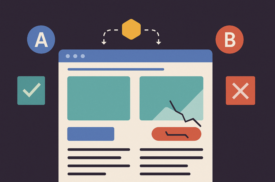
User research and A/B testing can help you determine which aspects of your site need improvement and what changes can lead to a better user experience. Improving the user experience on your eCommerce site can lead to increased conversion rates, higher customer retention, and more sales.
By upgrading the customer experience, you can attract new customers and retain existing ones, ultimately increasing the success of your eCommerce business. With better results all around, especially for your bottom line, your business can’t afford to avoid optimizing UX.
Co-Founder & Managing Partner
Yusuf Shurbaji has over a decade of ecommerce growth experience. His past work includes building optimization departments & running experimentation inhouse and agency side for Dior, JCPenney, LVMH, American Precious Metals Exchange, Princess Polly, Built Brands, Ladder Sport, Maze Group, HelloFresh, Ledger, Blockchain.com, Kind Snacks, and other 9-figure brands. Yusuf is a Co-Founder of Prismfly, a conversion rate optimization agency focused on growing revenue and EBITDA for D2C ecommerce brands. Prismfly is the first CRO focused Shopify Plus certified agency and has seen triple digit growth the past 2 years.