Thank you! Your submission has been received!
Oops! Something went wrong while submitting the form.

April 24, 2023
|
11.5
min read
Is your ecommerce site bringing the heat? Where are your users finding the most satisfaction on your site?
If you’re not already using a website heatmap, there are plenty of reasons to start. After all, a happy website visitor is the first step towards a successful ecommerce site.
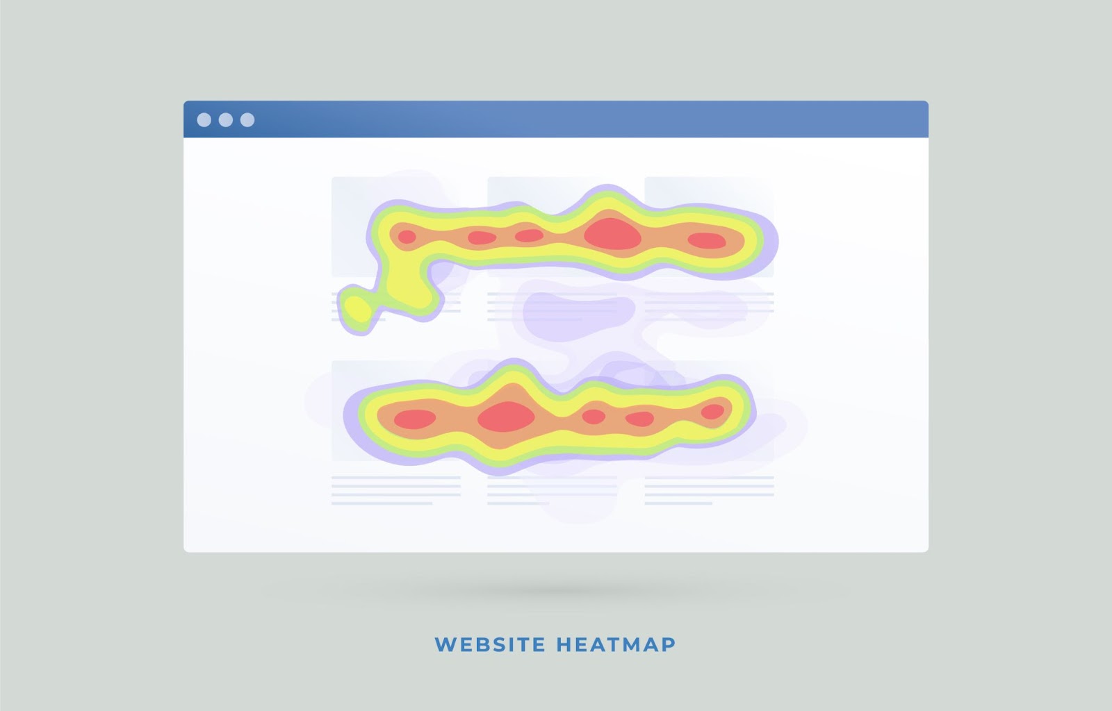
A heatmap is a type of visual graph, like the visuals used during weather forecasts and in population density reports. It’s a color-coded visual representation of data.
A website heatmap, specifically, is a visual report of the way your users interact with your site. It uses warm to cool colors to show engagement, reds showing the most engagement, and deep blue showing the least engagement.
Website heatmaps can show you what’s getting the most clicks in comparison with the rest of the page, what’s holding your users' attention, and what’s getting ignored completely. This data can help you improve your website’s user experience — but more on that later.
There are four basic types of heatmaps to use on your product pages, landing pages, and more.
1. Click Tracking
A click-tracking heatmap illustrates where users are clicking on your page in real time and with what frequency. Click data tracking maps are excellent for collecting data on what actions your users are actually taking while viewing your homepage or another page on a mobile or desktop device.
Are your users taking the actions you want them to take, or do they drop off? A click-tracking map will show you visitor behaviors that meet, or do not meet, your expectations. If users are consistently hitting your call to action or if they’re getting distracted by something else on the page, you’ll know that your site’s usability and functionality either need improvement or are right where they need to be.
2. Scroll Tracking
Scroll maps are website heatmap tools that record how deep your users scroll on any given page. They’ll show breakpoints where most users stop scrolling, as well as a gradient of all stopping points. Scroll maps are some of the best heatmap tools and are excellent at illustrating the ideal length of your page.
If you find that most visitors who come to the page only view halfway down before leaving, then that’s half of the important content they’re missing out on! In cases like this, you'll learn to modify the amount of content on a single page — either condense or create a new page for the ignored content.
There are several reasons a scroll abandon point might be where it is, but it’s up to your UI team to assess. Is the CTA button in a poor spot? Is there a distracting, clickable element before they reach the end of the page?
Your page may also have a readability issue or feature lackluster content.
3. Mouse Movement Tracking

Hover tracking is another use case for heatmaps. This tool maps cursor movement between clicks. They show how long your users spend hovering over different areas of your site.
The primary drawback to hover tracking maps is that they provide little to no data about user intention. Sure, their mouse may be hovering near your CTA button, but the user may actually be reading the copy on the other side of the page.
These maps are not the most reliable way to gather meaningful data, but they are useful when collecting passive data about your users.
Additionally, just like click tracking maps, they’re helpful tests when you do not have resources to conduct a lab test because they can be done remotely and without supervision.
4. User Eye Tracking
User eye-tracking maps (also called attention maps) are perhaps the most challenging heatmap to generate. They demand special equipment, special permissions from the users, and a greater budget.
While eye tracking can be done via webcam, the data will not be as accurate as data gathered with devices specifically designed to track and interpret eye movements.
Eye tracking maps can provide the most user data of any heatmap, especially if it works in tandem with a click tracking map.
Different time frames for this data can change the information you gather. For example, a map that displays eye movement for the first five seconds will tell you where the eyes are instinctively drawn, whereas eye tracking data that covers the first two minutes will show where users are looking with intention.
There are two subtypes of eye-tracking maps: Focus volume and focus duration.
With this data, you can place critical elements in your users' natural eye line or isolate distracting elements.
You can track clicks, movement, scroll depth, focus, and engagement over any period of time. heatmaps make it much easier for humans to understand the data points collected during the study by creating a visual.
Please note that not all heatmapping tools give you the ability to create all types of heatmaps, nor can they record all relevant kinds of data. You need to get specific tools to create the kinds of heatmaps your business will most benefit from.
When you choose your heatmapping tools, look for a tool that does session recording as well to provide you with more context for the data. Often, recording tools can be bundled with data collection.
Naturally, you want to choose the best heatmap tool available to get the most bang for your buck. Based on our own experience, Prismfly has a few pro tips when it comes to choosing the right heatmap software for your site, plus we have a few recommendations of our own.
Heatmaps are incredibly resourceful for any website looking for insights on users. From software engineers to brand marketers, anyone and everyone can decipher user behavior with easy-to-interpret engagement maps.
Heatmaps can help you understand what catches users’ eyes. With a DXI solution like FullStory, you can access colorful new heatmaps — or Click Maps — with Page Insights from any session replay. Use FullStory’s heatmaps on your homepage, your products page, your purchase forms, or any new features to get a high-level view of how your user is engaging with just about anything.
Check the pulse of any page on your site or app to see how users are navigating and exploring your content. Validate design and messaging and watch where users are responding as expected or clicking astray to identify issues (and wins). Prioritize hypothesis testing by examining scrolls and clicks, detect areas ripe for optimization, and collaborate with your team to ideate solutions.
See the “why” behind user behavior patterns. If an element isn’t performing as expected, jump into one of FullStory’s diagnostic features like Session Replay to understand what’s going wrong.
Draw insights from data you can trust. Click maps and scroll maps give a crystal-clear picture of user engagement without the confounding factors of screen resolution, dynamic page content, pop-ups, or confusing “splotches.” Inspect specific user segments and answer questions like “What do visitors from my ad campaign click on first?”, "How do returning customers interact with our navigation?", or “Are users clicking on the latest product update?”
"FullStory offers such a unique way to interpret user engagement and interaction data to understand your end users better." - Validated G2 Reviewer
Learn more about heatmaps in FullStory to see how they can help you craft a more perfect digital experience.

A well-executed heatmap can help you strengthen your website’s performance in a number of ways.
If your heatmap shows users spending time on a certain section, that can mean good things or bad things; context is key.
Lots of time spent in one area can mean it is confusing. However, a lot of time spent or clicks in a section could also mean users love that section or are actively reading. Consider both when reviewing heatmaps.
When you’re looking specifically for weaknesses, consider this: do your other analytical tools support the same conclusion?
If the attention map for your FAQs section shows a lot of user time spent on a particular question, the relevant product hasn’t been selling well, and your contact us page gets constant questions about the same issue, then the copy on the relevant product page is likely unclear.
heatmapping can help you locate problems, but you’ll need to synthesize information from other analytical tools to solve them.
Online businesses succeed when their users are happy. If you walked into a physical store and found it messy, poorly laid out, and lacking helpful signage, you would simply leave and buy your shopping list someplace else. Online, “someplace else” is three clicks away, so optimizing UX is critical.
Getting heatmap reports for each of your website pages will tell you if your users are sticking around to browse, even if they don’t buy, or if they’re taking one look at the shop and clicking away dissatisfied.
By reviewing session recordings with a website heatmap tool, you can further analyze a/b testing results. If you haven’t already begun A/B testing on your site, you should consider it.
A/B testing is extremely practical and gives you ready-to-implement results. Adding a heatmap analysis to your A/B test gives your A/B test an edge.
A heatmap can help you turn “Add to Cart” into “Order Placed.” A heatmap will show you if your site visitors are on the right track toward conversion or if they’re meandering away from your CTA.
Using multiple types of heatmap reports can get you a clearer image of your website visitors' behavior. You may know that your site sold 50 units of product A, but what if you also knew that the image of the product received 10% more clicks than the actual link to the product page?
What if you knew that users on the product page were consistently clicking to your clearance page instead of clicking Add to Cart?
50 units sold in a given timeframe might meet your expectations. Still, this user data may prompt you to set your expectations even higher and start implementing solutions to improve your CRO.
Test the Effectiveness of a Call-To-Action (CTA) Message
A strong CTA can make or break a sale. If you have multiple CTAs on a page, the heatmap can show you how well they’re doing in competition with each other.
Which CTA is getting the most attention and why?
If you try using A/B testing in conjunction with your heatmap tools, you can get a sense of how changing the phrasing or placement of your CTA impacts the user interactions.
Let’s dispel some common misconceptions about heatmap software with some facts:
When an element with fewer pixels gets the same number of clicks as an element with more pixels, the clicks become more concentrated in a single area.
On a heatmap, it will appear as though the element is getting more clicks; it will appear a darker red. heatmaps measure interaction with a certain area, not a certain page element. Be aware of this concentration effect when interpreting the results.
Like any graph or datasheet, heatmaps require analysis in order to serve any practical purpose. Raw data is nice to have, but it’s a tool, not a solution. Graphs can sometimes be misleading if they’re not accompanied by critical analysis. When you receive data from your heatmap, apply critical thought and put it in the context of your site and your users. Remember, there's a human behind every data point, and humans aren’t perfect logic machines.

So, the big question is, “How can we apply heatmaps to our CRO?” Here’s the actionable breakdown:
Set a specific goal for your CRO. Examine industry averages, study competitor data, or identify trends in your own company’s growth.
How much growth do you realistically want to see in a set amount of time? Determine your metrics for success at the end of this process.
Determine which heatmaps work best for you: eye-tracking heatmaps, click heatmaps, mouse-tracking heatmaps, or scroll heatmaps. Make a plan for what areas of your website, if not all of it, you want to examine.
This is where the heatmaps come in. Set up your user tests as selected by your strategy. As your heatmap software gathers user data, it will generate your heatmap.
Take an educated guess on causation after viewing the heatmap. Use the heatmap to determine your weak areas and your strong areas.
Utilize A/B testing to test your hypothesis on landing or product pages. Pay special attention to CTA positioning. Clearly define who you’re testing and what elements you’re examining.
Was your hypothesis correct? Based on your heatmap and the following A/B testing, what are the next steps your ecommerce site needs to take to drive up the conversion rate?
You’ve got your solution, now it’s time to make it happen! If you need help implementing your results, Prismfly is here to help. If you need a hand from masters of CRO, drop us a line today!
Co-Founder & Managing Partner
Yusuf Shurbaji has over a decade of ecommerce growth experience. His past work includes building optimization departments & running experimentation inhouse and agency side for Dior, JCPenney, LVMH, American Precious Metals Exchange, Princess Polly, Built Brands, Ladder Sport, Maze Group, HelloFresh, Ledger, Blockchain.com, Kind Snacks, and other 9-figure brands. Yusuf is a Co-Founder of Prismfly, a conversion rate optimization agency focused on growing revenue and EBITDA for D2C ecommerce brands. Prismfly is the first CRO focused Shopify Plus certified agency and has seen triple digit growth the past 2 years.